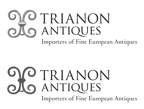
Trianon Antiques — Proposed Logo

These are two proposed variations of the logo: one has an engraved look and the other evokes the appearance of a maker’s mark such as one might find on 18th century furniture, metalwork, or porcelain.
Two subtle elements are at work in this logo. One interpretation of the shapes would have us see two letters “C” — as a means of reflecting the owners’ initials. So in this case the two letters “C” appear as though “back to back.” A second interpretation would have the mark representing the initials of the company name, “T” and “A,” which do indeed appear as though stacked one above the other.
